Magazine cover analysis 1
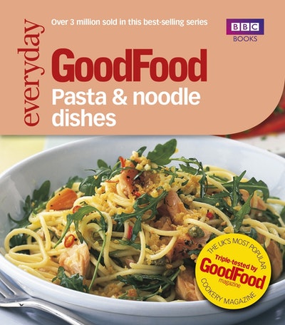
Let's start right away, the pasta is of course the main image which is a flat photograph with barely any editing. The next thing that we notice the peach/pink background behind the main text covering a little less than half of the page. The text itself brings the reader to a normal and comfortable playing field rather than classy words which make people who are easy to fool and making something which is ordinary or less into something profitable. But the latter half the smart people some will directly avoid them or indirectly refuse these magazines or some of them in elder or knowledgeable might enlighten the rest.
BENEFITS:
-By establishing how many copies sold the magazine can gain a lot of attractions, so that's a good move!
-Since the magazine has been approved of / published by BBC books people can trust it's contents and sometimes it will filter most of the people who would otherwise write bad about the magazine.
Since there is less criticism people will be more willing to try to read your magazine.
-The next benefit that adds to the credibility of the magazine it the yellow-round-sticker on the bottom right corner which reads-"THE UK'S MOST POPULAR TRIPLE-TESTED BY (SPACE) GOODFOOD MAGAZINE(SPACE) COOKERY MAGAZINE"
Now, the benefits which are listed above are only the factors that critically analyze the content and make the readers feel more safe and will not publish the magazine's content if said standard is not met.
THE LAST BENEFIT OF HAVING A MAGAZINE DESIGNED IN THIS FASHION IS TO MAKE THE MAGAZINE MORE APPROACHABLE BY IT'S SIMPLISTIC DESIGN WHICH IS SIMILAR TO THE FOOD CARTONS KEPT BY SUPERMARKETS WHICH MAKES IT INSTINCTIVELY THE BEST CHOICE FOR FOOD LOVERS WHO ARE REGULAR MARKET CUSTOMERS


Comments
Post a Comment