Creating a layout that makes use of common eye movement
Size- Depending upon if the size of the content is bigger or the size of the content is smaller, the reader's eye gives that much relevance to the content.
Color-Brighter colors catch the reader's eye first and darker colors after that.
Contrast-No matter how good or bad the content is there must always be a hierarchy of colors used with the important content being brighter that the less important content unless this distinct difference exists the content will appear cluttered in the reader 's mind.
Alignment-When a reader starts reading they expect content of the same genre/type to be segregated from other types of content.The position of the content in the layout is what matters and we will delve into it later in this article.
Repetition- Repeat patterns can be used when aligning content as we can issue one design style for one kind of content and another for other types of content.
Proximity-We use this when we want to segregate content and depending on how close the 2 types of content are the more they are likely to be related.
White space-Especially in the design industry one must know how to use negative space for further building upon the contrast aspect of the layout. It gives relief to the reader and helps them understand and process the content presented to them.
Texture and style- When presenting content it is best to not delve into stereotypes as they become redundant are go unnoticed by the reader. Instead we can add texture and stylize the design/the illustration side of the content and make it pop out.
For example;

although this is a rough example I feel it can give you a picture of how texture and style can be added in to attract the viewers attention.
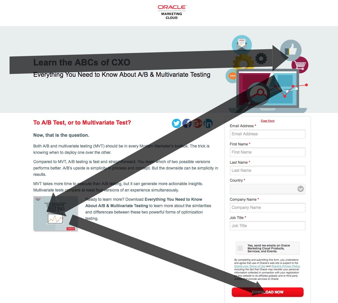
Z Pattern:This is an example of a pattern that most content creators/artists/illustrators use to create a sense of control of where their viewers' eyes' move.
The reason why it is called the "Z" pattern is because the way the eye moves from one content to the other ,forms a pattern between the four points that resembles the alphabet "Z". This is used when the content is relatively less.
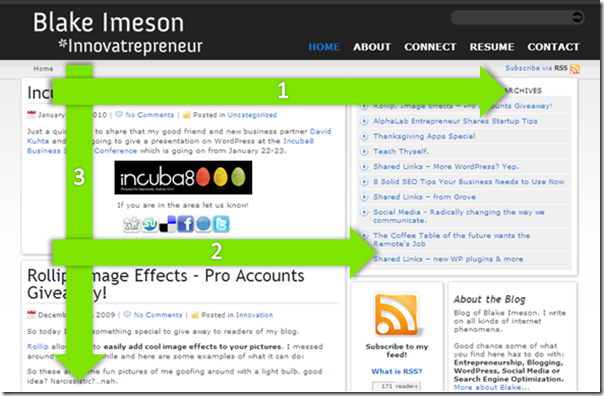
F Pattern: Just like the "Z" pattern , "F" pattern is also used by any artist/creator/illustrator.
But the "F" pattern is used only when delving deep into a topic/if there is a lot of written content.
-THANK YOU!


Comments
Post a Comment