Posts

Showing posts from February, 2020

Illustrator tryout 5 ( preliminary )
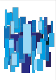
Image
This was an experiment to try and work with squares and rectangles. It directly connects with my magazine work as I was initially attempting to create buildings to practice for my magazine cover that I am planning to do through digital art. I was able to successfully create depth in my work using light and dark colors and personally feel  that if this was an animation project the art style would look pretty clean!! I wanted to go with different shades of blue to make the color pleasing to the mind and it would also make it subconsciously easier for me to start off with the motif itself.

Creating a layout that makes use of common eye movement

Image
Size- Depending upon if the size of the content is bigger or the   size of the content is  smaller, the reader's eye gives that much relevance to the content. Color -Brighter colors catch the reader's eye first and darker colors after that.  Contrast -No matter how good or bad the content is there must always be a hierarchy of colors used with the important content being brighter that the less important content unless this distinct difference exists the content will appear cluttered in the reader 's mind.  Alignment -When a reader starts reading they expect content of the same genre/type to be segregated from other types of content.The position of the content in the layout is what matters and we will delve into it later in this article. Repetition - Repeat patterns can be used when aligning content as we can issue one design style for one kind of content and another for other types of content. Proximity -We use this when we want to segregate content and dep...

illustrator tryout 4 (preliminary task)

Image
 I feel that this task was the most interesting of them all and it was a little experiment to see what scale of illustrator I can use to draw and see how good my drawings can be here. Although this is a tracing, it proves that if you spend enough time you can make a drawing a lot more detailed.  This was a very peculiar way to use the line segment tool and the eraser tool. I learnt that in illustrator you can use the direct selection button to select the points/lines  and only then can you use the eraser tool to erase the points/lines that are to be erased. After this, I wanted to try and use the brush tool while continually holding the click button and not releasing it ! I also wanted to decrease the opacity to make sure that the detail is not completely lost. The above screen shots are an example of what I said. It created a very smooth and thin layer kind-of effect that did not have liney/stroke-like effect that I thought it would! -Thank you!