Posts

Magazine Final As level Post (reworked)
Image
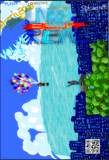
  I have reworked the Contents page and the Double spread. Contents page: I made the images sharper and edited out the left over white space which I previously could not do resulting in better balance overall. Double Spread: The layout of the double spread has been changed to become content that is more evenly distributed along the spread. The spacing of the current layout along with the bigger font size allows for a better reading experience. The current layout has been chosen out of 3 layouts to best represent a Double Spread. Cover Page: The cover Page was left alone, as I felt it did not require any change.

PHOTOS FOR THE DOUBLE SPREAD, THE LAYOUT, WHAT WENT WRONG AND HOW I CORRECTED IT?

Image
  As you can see the majority of the text is not visible and even some of the pictures are masked by the big picture in the background. Although the layout is fine the content is too much for this layout and decreasing the text size should have been the right choice but it is barely visible.    These are the best of the pictures I took for the siphoning experiment. The problem is that all my pictures look flat in comparison to my art and do not look a part of the layout in the first attempt of the double spread and this is solved by changing the layout for the second attempt. But my contents page suffers the most from the aforementioned blend between art and pictures, and removing the art will destroy the effect that I wanted to convey of how the design, layout and illustration play a big part in how the reader is interested in said content. I was able to change the contents page and make it less cluttered. I changed the over all layout from A4 to landscape to facilitate fo

WHICH CONVENTIONS OF MAGAZINES DO I BREAK AND HOW?

Image
            VS  Although this is not a fair comparison as the former is just a page out of a magazine while the latter is a double spread. Here I broke the convention by having illustrations in the background and pictures only at the key moments of the experiment's explanation( the materials required ). The pictures in the left side represent how the general set up would work and clarifies any doubts the reader has about the experiment. The text in the former( the magazine page ) is only there to give the reader  awareness of the subject matter  rather than present it to them . It serves the same purpose as a news paper article which solely exists to give the reader the information in the cheapest and most easily accessible manner and make them aware of the current situation the human society is in. Thus, I reiterate that all content creators and publishers like magazines have to keep in mind and target the photographic memory of the viewer/reader rather than using c

UNREAL-BUT-REAL-MAGAZINE-SUBMISSION

Image
My online magazine targets children above 10 years who have love for science and experimenting as I always did. The magazine will raise the curiosity of the reader and will also promote Science as a fun activity. My cover page idea is based on a thought I had "flight into the never before seen skies even past the clouds", this idea has the clouds as obstacles and the young boy getting through them with ease. The contents page's artwork came to be when this idea created another topic to work on " Onward to space!!" which is why I drew children riding on a Rocket to space. These thoughts and their respective illustrations symbolize the infinite possibilities that lie in science, and that it can be a very enjoyable journey if taken with the right approach. The Double Spread has a background of large water bubbles symbolizing infinite possibilities, and as the experiment is to do with water I felt this to be apt. The photos I have click

CRITICAL REFLECTION SCRIPT

How does your product use or challenge conventions and how does it represent social groups or issues? I want my magazine to be comfortably read. In my attempt to achieve this, I break the conventions or preconceived notions It is assumed that this allows the reader to connect with the magazine's ideas and buy more copies of the magazine if the celebrities are popular. Although on the surface level this looks good, it inevitably fails as the magazine is relying upon those people for its promotion. Without them the magazine is not much, the readers will soon realize this and the only readers the magazine is left with are the masses that want to see the celebrities face. Secondly when a magazine relies on the people who support it rather than its concept, the core audience/target audience will distance themselves from it. Talking about the achievement, rather than the people who achieved it will improve the magazine as a whole. For a magazine to truly have a good li

blog progress

Image
I  used illustrator  for the cover page and it took a long time for correction even with stylu. Dealing with multiple layers made it complicated layers  Illustrator cover issue text was color yellow and orange because it was written in line with the magazine font color  Illustrator cover volume was color blue white because the colors went well with the water the sky and the buildings First Illustrator, then transferred to Photoshop to create soft light, blur, layering and stylizing effects for post processing to make the cover look more polished.  In this blog I am going to cover various aspects of my magazine preparation. I took photographs in different light setting, each catering to a different background or environment, Illustrator has been a software that I have been exploring and getting quite comfortable with  especially with my laptop at home which is equipped with a stylus !  With the help of the brush tool and the zoom tool i have been able to

dinousaur illustrator work complete for title

Image
I finished the dinosaur and am going to use it in conjunction with my logo..