Posts

Dinosaur illustrator work in progress

Image
This a piece that I worked on illustrator with the idea of creating something only with squares

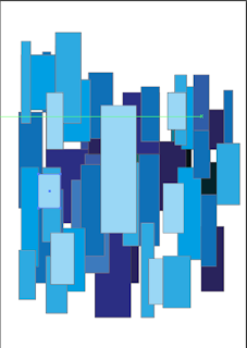
Illustrator tryout 5 ( preliminary )

Image
This was an experiment to try and work with squares and rectangles. It directly connects with my magazine work as I was initially attempting to create buildings to practice for my magazine cover that I am planning to do through digital art. I was able to successfully create depth in my work using light and dark colors and personally feel  that if this was an animation project the art style would look pretty clean!! I wanted to go with different shades of blue to make the color pleasing to the mind and it would also make it subconsciously easier for me to start off with the motif itself.

Creating a layout that makes use of common eye movement

Image
Size- Depending upon if the size of the content is bigger or the   size of the content is  smaller, the reader's eye gives that much relevance to the content. Color -Brighter colors catch the reader's eye first and darker colors after that.  Contrast -No matter how good or bad the content is there must always be a hierarchy of colors used with the important content being brighter that the less important content unless this distinct difference exists the content will appear cluttered in the reader 's mind.  Alignment -When a reader starts reading they expect content of the same genre/type to be segregated from other types of content.The position of the content in the layout is what matters and we will delve into it later in this article. Repetition - Repeat patterns can be used when aligning content as we can issue one design style for one kind of content and another for other types of content. Proximity -We use this when we want to segregate content and dep...

illustrator tryout 4 (preliminary task)

Image
 I feel that this task was the most interesting of them all and it was a little experiment to see what scale of illustrator I can use to draw and see how good my drawings can be here. Although this is a tracing, it proves that if you spend enough time you can make a drawing a lot more detailed.  This was a very peculiar way to use the line segment tool and the eraser tool. I learnt that in illustrator you can use the direct selection button to select the points/lines  and only then can you use the eraser tool to erase the points/lines that are to be erased. After this, I wanted to try and use the brush tool while continually holding the click button and not releasing it ! I also wanted to decrease the opacity to make sure that the detail is not completely lost. The above screen shots are an example of what I said. It created a very smooth and thin layer kind-of effect that did not have liney/stroke-like effect that I thought it would! -Thank you!

Photographing the science experiment

The trouble with an experiment is that first you have to conduct the experiment after which you have to try and photograph and capture the moment when the water is flowing through a tube or when a chemical is reacting. etc. The experiment was tested out by my grandfather and myself before the actual photo shoot for which my father also helped. So while I was photographing the experiment I had to figure out the timings to which my father and grandfather would start and finish the experiment. I also learned to adjust the lens to capture the photo and tried out different light and dark settings for enhancing the photos. I also took photographs of the different material required for the experiment with my background as grass. A previous attempt at conducting the experiment out in the open failed as Number 1 my set up was wrong and I could not think straight in afternoon sun Number 2 There were many insects around me and I could not stay still and focus for taking photographs.

Why I do not want people to be the main focus of my magazine

 I want my magazine to be comfortably read, which is why most magazines add people/models . It is assumed that this allows the reader to connect with the magazine's ideas and buy more copies of the magazine if they celebrities or are popular. Although on the surface level this looks good it inevitably fails as the magazine is relying upon those people for it's promotion. Without them the magazine is not much, readers will soon realize this and the only readers the magazine is left with are the masses that want to see the celebrities face. Secondly when a magazine relies on the people who support it rather than its concept the core audience/target audience will distance themselves from it. Talking about he achievement, rather than the people who achieved it will improve the magazine as a whole. For a magazine to truly have a good life span a good concept/topic along with a layout that is easy for the eyes of the reader to follow is important. This has to be followed w...

My first experience with Adobe Illustrator (preliminary task)

Image
Illustrator is software I am trying to work with to make my coursework content more design friendly, which also enables my readers to not feel like they are only seeing pages of text and photographs. I was able to start working in illustrator, and within an hour or so I was able to progress well. I got the feel for the software, and was experimenting with the features that it provided. I initially  tried out the brush tools and did some sketches. Then I wanted to try and import an image to see if it works like Adobe Photoshop. After which I was having a blast with the rotate and sizing tool. The spiral tool and flare tools intrigued me as they were both very unusual tools. When I use the flare tool, it creates a pattern that uses circles with light and shadow( which honestly reminds me of solar systems and supernovas ). And it allows you to control the radius and light and shadow effects to create an effect as you can see above. And finally I was able to find the ...