Posts

Magazine Final As level Post (reworked)
Image
  I have reworked the Contents page and the Double spread. Contents page: I made the images sharper and edited out the left over white space which I previously could not do resulting in better balance overall. Double Spread: The layout of the double spread has been changed to become content that is more evenly distributed along the spread. The spacing of the current layout along with the bigger font size allows for a better reading experience. The current layout has been chosen out of 3 layouts to best represent a Double Spread. Cover Page: The cover Page was left alone, as I felt it did not require any change.

PHOTOS FOR THE DOUBLE SPREAD, THE LAYOUT, WHAT WENT WRONG AND HOW I CORRECTED IT?

Image
  As you can see the majority of the text is not visible and even some of the pictures are masked by the big picture in the background. Although the layout is fine the content is too much for this layout and decreasing the text size should have been the right choice but it is barely visible.    These are the best of the pictures I took for the siphoning experiment. The problem is that all my pictures look flat in comparison to my art and do not look a part of the layout in the first attempt of the double spread and this is solved by changing the layout for the second attempt. But my contents page suffers the most from the aforementioned blend between art and pictures, and removing the art will destroy the effect that I wanted to convey of how the design, layout and illustration play a big part in how the reader is interested in said content. I was able to change the contents page and make it less cluttered. I changed the over all layout from A4 to landscape to...

WHICH CONVENTIONS OF MAGAZINES DO I BREAK AND HOW?

Image
            VS  Although this is not a fair comparison as the former is just a page out of a magazine while the latter is a double spread. Here I broke the convention by having illustrations in the background and pictures only at the key moments of the experiment's explanation( the materials required ). The pictures in the left side represent how the general set up would work and clarifies any doubts the reader has about the experiment. The text in the former( the magazine page ) is only there to give the reader  awareness of the subject matter  rather than present it to them . It serves the same purpose as a news paper article which solely exists to give the reader the information in the cheapest and most easily accessible manner and make them aware of the current situation the human society is in. Thus, I reiterate that all content creators and publishers like magazines have to keep in mind and target the photographic me...

UNREAL-BUT-REAL-MAGAZINE-SUBMISSION

Image
My online magazine targets children above 10 years who have love for science and experimenting as I always did. The magazine will raise the curiosity of the reader and will also promote Science as a fun activity. My cover page idea is based on a thought I had "flight into the never before seen skies even past the clouds", this idea has the clouds as obstacles and the young boy getting through them with ease. The contents page's artwork came to be when this idea created another topic to work on " Onward to space!!" which is why I drew children riding on a Rocket to space. These thoughts and their respective illustrations symbolize the infinite possibilities that lie in science, and that it can be a very enjoyable journey if taken with the right approach. The Double Spread has a background of large water bubbles symbolizing infinite possibilities, and as the experiment is to do with water I felt this to be apt. The photos I have click...

CRITICAL REFLECTION SCRIPT

How does your product use or challenge conventions and how does it represent social groups or issues? I want my magazine to be comfortably read. In my attempt to achieve this, I break the conventions or preconceived notions It is assumed that this allows the reader to connect with the magazine's ideas and buy more copies of the magazine if the celebrities are popular. Although on the surface level this looks good, it inevitably fails as the magazine is relying upon those people for its promotion. Without them the magazine is not much, the readers will soon realize this and the only readers the magazine is left with are the masses that want to see the celebrities face. Secondly when a magazine relies on the people who support it rather than its concept, the core audience/target audience will distance themselves from it. Talking about the achievement, rather than the people who achieved it will improve the magazine as a whole. For a magazine to truly have a good li...

blog progress

Image
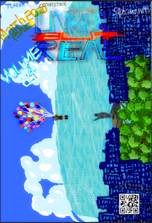
I  used illustrator  for the cover page and it took a long time for correction even with stylu. Dealing with multiple layers made it complicated layers  Illustrator cover issue text was color yellow and orange because it was written in line with the magazine font color  Illustrator cover volume was color blue white because the colors went well with the water the sky and the buildings First Illustrator, then transferred to Photoshop to create soft light, blur, layering and stylizing effects for post processing to make the cover look more polished.  In this blog I am going to cover various aspects of my magazine preparation. I took photographs in different light setting, each catering to a different background or environment, Illustrator has been a software that I have been exploring and getting quite comfortable with  especially with my laptop at home which is equipped with a stylus !  With the help of the brush tool and ...

dinousaur illustrator work complete for title

Image
I finished the dinosaur and am going to use it in conjunction with my logo..

Dinosaur illustrator work in progress

Image
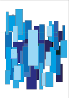
This a piece that I worked on illustrator with the idea of creating something only with squares

Illustrator tryout 5 ( preliminary )

Image
This was an experiment to try and work with squares and rectangles. It directly connects with my magazine work as I was initially attempting to create buildings to practice for my magazine cover that I am planning to do through digital art. I was able to successfully create depth in my work using light and dark colors and personally feel  that if this was an animation project the art style would look pretty clean!! I wanted to go with different shades of blue to make the color pleasing to the mind and it would also make it subconsciously easier for me to start off with the motif itself.

Creating a layout that makes use of common eye movement

Image
Size- Depending upon if the size of the content is bigger or the   size of the content is  smaller, the reader's eye gives that much relevance to the content. Color -Brighter colors catch the reader's eye first and darker colors after that.  Contrast -No matter how good or bad the content is there must always be a hierarchy of colors used with the important content being brighter that the less important content unless this distinct difference exists the content will appear cluttered in the reader 's mind.  Alignment -When a reader starts reading they expect content of the same genre/type to be segregated from other types of content.The position of the content in the layout is what matters and we will delve into it later in this article. Repetition - Repeat patterns can be used when aligning content as we can issue one design style for one kind of content and another for other types of content. Proximity -We use this when we want to segregate content and dep...

illustrator tryout 4 (preliminary task)

Image
 I feel that this task was the most interesting of them all and it was a little experiment to see what scale of illustrator I can use to draw and see how good my drawings can be here. Although this is a tracing, it proves that if you spend enough time you can make a drawing a lot more detailed.  This was a very peculiar way to use the line segment tool and the eraser tool. I learnt that in illustrator you can use the direct selection button to select the points/lines  and only then can you use the eraser tool to erase the points/lines that are to be erased. After this, I wanted to try and use the brush tool while continually holding the click button and not releasing it ! I also wanted to decrease the opacity to make sure that the detail is not completely lost. The above screen shots are an example of what I said. It created a very smooth and thin layer kind-of effect that did not have liney/stroke-like effect that I thought it would! -Thank you!

Photographing the science experiment

The trouble with an experiment is that first you have to conduct the experiment after which you have to try and photograph and capture the moment when the water is flowing through a tube or when a chemical is reacting. etc. The experiment was tested out by my grandfather and myself before the actual photo shoot for which my father also helped. So while I was photographing the experiment I had to figure out the timings to which my father and grandfather would start and finish the experiment. I also learned to adjust the lens to capture the photo and tried out different light and dark settings for enhancing the photos. I also took photographs of the different material required for the experiment with my background as grass. A previous attempt at conducting the experiment out in the open failed as Number 1 my set up was wrong and I could not think straight in afternoon sun Number 2 There were many insects around me and I could not stay still and focus for taking photographs.

Why I do not want people to be the main focus of my magazine

 I want my magazine to be comfortably read, which is why most magazines add people/models . It is assumed that this allows the reader to connect with the magazine's ideas and buy more copies of the magazine if they celebrities or are popular. Although on the surface level this looks good it inevitably fails as the magazine is relying upon those people for it's promotion. Without them the magazine is not much, readers will soon realize this and the only readers the magazine is left with are the masses that want to see the celebrities face. Secondly when a magazine relies on the people who support it rather than its concept the core audience/target audience will distance themselves from it. Talking about he achievement, rather than the people who achieved it will improve the magazine as a whole. For a magazine to truly have a good life span a good concept/topic along with a layout that is easy for the eyes of the reader to follow is important. This has to be followed w...

My first experience with Adobe Illustrator (preliminary task)

Image
Illustrator is software I am trying to work with to make my coursework content more design friendly, which also enables my readers to not feel like they are only seeing pages of text and photographs. I was able to start working in illustrator, and within an hour or so I was able to progress well. I got the feel for the software, and was experimenting with the features that it provided. I initially  tried out the brush tools and did some sketches. Then I wanted to try and import an image to see if it works like Adobe Photoshop. After which I was having a blast with the rotate and sizing tool. The spiral tool and flare tools intrigued me as they were both very unusual tools. When I use the flare tool, it creates a pattern that uses circles with light and shadow( which honestly reminds me of solar systems and supernovas ). And it allows you to control the radius and light and shadow effects to create an effect as you can see above. And finally I was able to find the ...

Magazine cover analysis

Image
The cover's art consists of cups with intricate designs on them , the first one being a peahen in blue color, the second one being a peacock in gold, the third and the fourth one seems to have a focus on concentric circles. The background is made up of a rectangle(light grey) with triangles(darker shade of grey ) on the top. The background covers most of the page but not all of it, there is space left purposely for the title and borders. The bar code, the issued month and the web address of the magazine are mentioned in the top right corner of the magazine cover. The bar code and the web address are presented to enable the reader to gain access to more information if the the reader wishes to do so. The title  " CERAMIC REVIEW " has a very serene color and font that blends in with the cover art, thus overall representing a mild toned magazine cover. The setup of the picture itself, has been made as if the cups are lines up one after another neatly match the table...

What are or what is "manga" and what is "anime"?(and related topics)

Image
MANGA Developed in Japan in the late 19th century, manga is an art form which exist as graphic novels as well as digital comics.They are written in Japanese and illustrated by artists who either themselves are the story writers or pair up with story writers to write and illustrate manga. Manga are art and illustration heavy comic books which are a medium popular globally and as a fact 35% of French comic books are taken up by manga. As for the reasons why manga is so popular, it is presented below: 1) The medium allows an extreme amount of freedom in terms of content being produced thus attracts a lot of people from the creative industry and gives content to every kind of individual that you can possibly find.The only down factor faced by the illustrators and writers is that only popular content sells and that depending upon the book sales they get paid respectively. 2)The medium is very attractive to artists who are otherwise only given time to shine either by exhibitions...

Peer Review

Hey everyone, I want share and reflect on my blog based on my classmate's evaluation of it as well as my review of her blog. REVIEW ON MY BLOG She mentioned that my manga blogs must be clearer, user-friendly and that I should address the topic as a whole to make my readers comfortable as well as, better appreciate my blogs. On the contrary, she mentioned that my blogs have a lot of research behind them and that I should keep that up, and I admit I sometimes have a lot or too less at hand when it comes to research which varies according to the topic at hand.( I plan on doing a blog based on the topic of" Manga and anime " in a few weeks, so look forward to it In terms of magazine content, she mentioned since my target audience are children my content should be in the best of legible formats, to which I replied that my font as well as my layout are to an extent very reader friendly, with my font being almost too reader friendly. When she asked about my genre I said...

Ford v Ferrari film review

The movie was a pleasant experience for those who love racing. It felt like the individual characters' vision came alive, thus the directing was good. The filming, sound and editorial departments have done a sincere job, and this painted before you as you see the movie. I was fascinated with the peculiar character behavior of Ken Miles. An instance of this is when he hits the car with a hammer to make the height requirements pointed out by the evaluator. Perhaps it's just me, but I tend to like people who do not sugar coat their words, or do things only because the society wants it and are professional, straight-forward and hardworking in their vision. This movie as a whole emphasized the courage and fear that racers carry with them while driving. And finally, I want to say that Ken Mile's son was a really well portrayed character as he did not waver and he understood his position and did not overreact and took it well in his hand!

Expectations for the Ford v.Ferrari movie

Hello everyone, today I am here to speak to about the movie I am going to watch tomorrow Ford v.Ferrari(if you have not guessed from the title !) I am a huge fan of technology and anything to do with electronics,engines and construction. - This my first expectation from this movie is to show to detail construction process and build up of the engines of  the cars and the framework.etc -I want the characters to feel real and not just have complete control of the car and act like kike they were born with the car.(i.e I want the drivers and constructors to have a deep understanding with the car and genuinely care about the car.) -I want them to emphasize how much work the constructors of the car put, to making the car safe and compete with the other! -I do not want the story to heavily rely on the emotional factor of family if there is any(as a lot of movies tend to have them and use them when they have weak story lines) Those are my expectations, let's hope I enjoy the mov...

Magazine cover analysis 1

Image
Let's start right away, the pasta is of course the main image which is a flat photograph with barely any editing. The next thing that we notice the peach/pink background behind the main text covering a little less than half of the page. The text itself brings the reader to a normal and comfortable playing field rather than classy words which make people who are easy to fool and making something which is ordinary or less into something profitable. But the latter half the smart people some will directly avoid them or indirectly refuse these magazines or some of them in elder or knowledgeable might enlighten the rest. BENEFITS: -By establishing how many copies sold the magazine can gain a lot of attractions, so that's a good move! -Since the magazine has been approved of / published by BBC books people can trust it's contents and sometimes it will filter most of the people who would otherwise write bad about the magazine. Since there is less criticism people will be m...